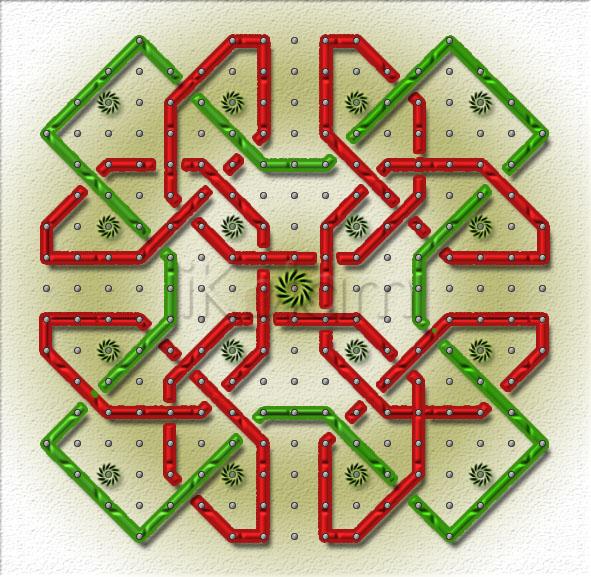
Nice PC kolam Judy mam. You have done your job in an excellent way.
Mahalakshmi
excellent .. -Indira Sundar
Excellent Judy. Very attractive colour combo and the texture of lines.
Pretty additional work to the original design Judy. The pottu patasu and chaku sakaram are happily hanging on the kolam. The colors and the texture are good and the green tint on the background looks pleasing.
I expected this kolam on Kitchen top:).
Judy, your execution is perfect!
fantastic Judy, very nice selection of coloured lines and the flowers at the centre. Expecially the flowers looks soooo cuuuute.
Your version of JKM sir's pattern looks very pretty, Judy. The red and green combination along with the kutti chakras make your kolam very attractive!
-Sindhuja
Fantastic, Judy u have done a marvellous job with PC. The tube like lines the chakram like flowers, the cute pearl like dots. the colors choosen are very nice. Let us see what comment u get from JKM Sir.
rajamma
itz very pretty!-suguna murugesan
Wow....awesome creation in photoshop judy...i liked all d things associated with this version of urs...d cols chosen, d dots, d cute li'le flowers all r too good....
Nice PC kolam with pretty colour combination.... I luv the chakram design flower....
Wow Judy what a wonderful job u have done... the colors are so pleasing and it seems like you have nailed the tubes onto a board... very well done one
Wonderful work,judy
beautiful PCkolam.
The dot pattern you followed is more or less similar to mine like dividing the space between two main dots into four parts. The sun-like symbol for the main dots, though attractive, reduces the overall symmetry. You could have chosen a symmetric symbol for it instead of a directional one. The addition of green line certainly fills the void. I did not think of it because I wanted to reproduce only the celtic knot with dots. This design will be very nice on handbags :-) Grand effort!
Regards! - mOhana
Fantastic, Judy .......looks like silk threads for me.....
Excellent creation and the colors you have used look so perfect with this design ....Iliked the cute kutty chakras.
Thanks so much Maha, Indira, Padma, Vinci (hope to make it on my kitchen top, let's see), Jaya, Sudha, Sindhu, Rajam, Suguna, Rani, Jayanthi, Pushpa, Veni, Sree, JKM (the best comment I ever received from you I think and I am on cloud nine. I followed the same dot pattern as you but had to extend it a bit as I wanted to add one section to your design As for the chakra design, it was a last minute addition and I see what you mean. I will try and change that and reload once again. Thanks for giving me this design to develop on - believe me it took more than one day to actually complete it as I had made so many different designs but this one was most pleasing), Laks and Sowmi for your encouraging words which makes me always want to do better next time..


