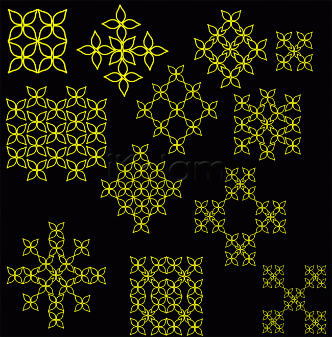
So many variations! My favorite color is black, and so might put this design in fabric section also, after enjoying your saree design, I'm "seeing" saree designs in all of your submissions! :)
I could hear mOhanaji saying " Sabhash, Sariyaana Potti"
Lata You know the best contrast colors that attracts the eyes are black and yellow? Next is red and white.Judy's designs are always very atractive.
These are really good and are pleasing to the eyes.
Taking the same basic motif and trying to arrange it in different ways instructs
one about the ideas of packing. Maximum efficiency packing leaves less unutilised
space whereas loose packing leaves lots of space. Seen the fruitseller arranging
oranges like a pyramid? It is the same principle.
About colour combinations, they are more individualistic. But red and blue give
a 3-d effect. Never use yellow on a white background. An interesting tidbit -
in the days of black-and-white films, to show the heroine dressed in a white sari,
they always used yellow sari!
Regards! - mOhana
Thank you Lata - hehe... just imagining you comparing all my designs with saree designs... actually there are so many more combinations - only that the page was too small - will make more on a bigger page and send later...
Rajamma you made my day saying that my designs are always attractive... humble thanks...
JKM thanks for your detailed comments... really throws light on many things... and yes I am also aware about the yellow saree used in black and white movies... good thought to share something interesting with everyone though....
Great idea judy. Lovely designs with striking color combination
thank yon Jayanthi
Waah!!! Judy is getting hitech .Waiting to see more of your creations.Next Ikolam meet you should start your demo classes.
Hey Sumathi this is an old one kanna... Jayanthi just dug it out from my gallery


