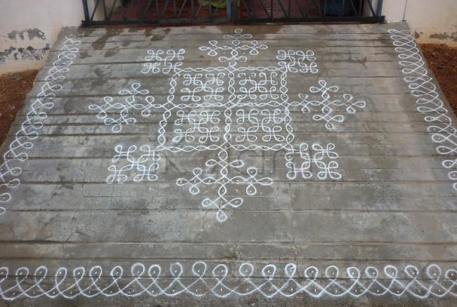
copy - paste, copy-paste, copy - paste, and created simple yet elegant kolam.{ by copy -paste, I mean doing the same design overall]
same design very well placed in so many places neatly to create such a big kolam. outer border is very neat.
rajamma
Very nice sikku kolam malar mam. nice creative work.
Mahalakshmi
very neat wk well executed, i think jude will luv it a lot
Thangai, Very neat and beautifull...(Thangai means younger sister)-Indira Sundar
Oh malar...superb wellknown kolam done so neatly by u...nice to see ur submission after ur green parrots kolam...ha...ha...
Very nice sikku kolam,malar
Simple sikku kolam joined together for a grand display.. Pretty even without colors.. And special mention about the borders, Neat and cute..
Sounds easy in computer language Jayanthi, but executing an extended chikku kolam (even if it is a simple one) in such equal proportion is an amazing job. Malar you are tryly very very talented. You also seem ti have a lovely big platform to display more such kolams, so I am sure we can expect to see much such creations from you.. SIMPLE YET AWESOME :)
Malar. Your kolam looks very pretty. Same design with uniform & clear strokes. Lovely
very well done sikku kolam.....so uniformly executed all sides.
Looks very fresh and neat. Copy-paste is the correct description for this kolam! Indira, is Malar your own sister?
Example for "sometimes simple , looks elegant"
Simply The Best Thanks
nicely connected, looks good
thanks anirudh
Very neat, lovely creation. Great idea and an excellent symmetry. Simple and sweet. - Indu
Yes Jayaji, she is my own sister...She is also a poet in tamil..-Indira Sundar
Is it so? Nice to know that she is a tamil poet! Her poems are welcome here too!
Malar and Indira, nice to know that A Tamil port in our group. I too try my hand in that occasionally. Did you read the poem on ikolam (In ikolam Birthday wishes?)
rajamma
Ah!! such lovely crisp strokes and so wonderfully done kolam... loved it
Very nice simple kolam done beautifully.
Malar, the kolam is very neat and symmetric. The thin strokes looks very neat and the borders too.


