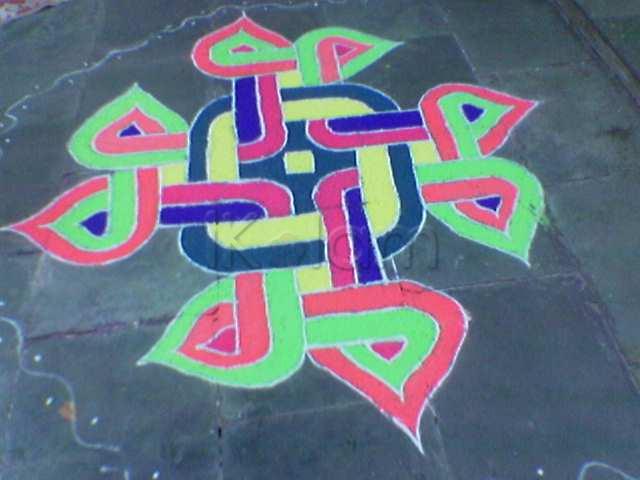
Nice choice of colors and well defined strokes. Just a thought, what made you choose magenta for the small domes on the north and south. Perhaps the same color that has been used on the right and left could have been better. :)
Nice kolam with good colour combination.
Very nice with colours....
wow...today all col kolams r so palich....i luv this for ur even spread of cols...i have seen a bigger version of this done by jaya mam...i think in kavi....
wow.that is so nice...
Neatly executed with nice colour combination. As said by lata mam, it would have been better if you had applied the same blue colour to all the small domes (Top and down).
Mahalakshmi.
The coloured version is also very nice. I too agree with Mahalakshmi.
Nice and neat execution.. Experts are on the way to tell about the color combo..
nice and neatly done....but i feel it would be better to use 4 colors (2-inner, 2-outer)...so that the linkage between the center design and the modak domes would be in sync.
very nice mam.
lovely color kolam.
Nice one
mOdakapriya must have given aamOda (nod) and derived lot of mOda (joy) from this :-)
Regards! - mOhana
I too immediately thought of Jaya's kolam during the ikolam meet (http://www.ikolam.com/node/11774?p=940). Neatly done with bright colours :)
Thanks a lot to one and all for the appreciation and as well as good suggestions to improve the colouring. (I agree I am not very good at colour combo). Therefore, this is a very good forum for me to improve myself. I have not seen Jaya mam's kolam. Would like to see it now.


