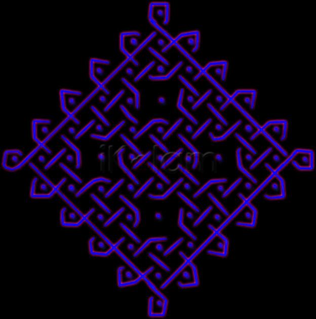
beautiful suba...d overlapping and underlying lines make such a difference to this normal sikku kolam...innum enna enna bakki irukku photoshopil vilayaada....eduthu vidunga...we r here to enjoy....
wow!!Fantastic,suba... i love the colour u have used and the overlapping lines and the design what else to say...all are beautiful.
Lovely display of interweaven lines and color. Nice technique. I feel my eyes are strained after viewing this color combo..
subha wonderful chiku kolam, excellent keep it up
Subha, by the way JKM sir will be very happy to see this, is it not sir ?
Suba, this 'weaving' kolam is wonderful. mOhanaji will be appreciating your work in a betterway. The dark background gives strain to the eyes.
rajamma
nice weaving effect.
Thank you Rani,veni, vinci,sudha(two times thanks)Rajam and anirudh.Rajam and vinci as soon as I saw your comments, I send another copy of same kolam for your opinion.
Suba lovely kolam and neatly done... maybe a lighter color for the lines would have enhanced the beauty on the black background... just an opinion dear
good kolam ....but the colour is so dark that ie reduces the effect of the kolam...
nice weaving effect.looks different.......
kolam is very nice with weaving effect and the colours look like neon lights.
Very Nice kolam
LOVELY. யாருங்க உங்க கம்ப்யூட்டர் teacher?
Beautiful weaving kolam! Loved your lavender color : )
very beautiful kolam and nice effect. Simple kolam looks great.
Wow Suba - you have surprised us with this perfect creation. Only thing you should have put white lines instead of blue it would have been excellent. Very very neat work - good for you :)


