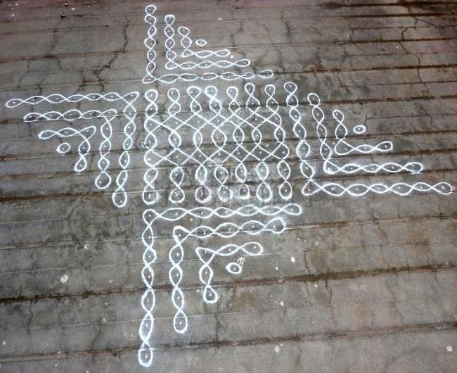
centre simple kolam but ur outer extended border is so nice malar.....and ur casual strokes r too good malar...
A different look to a simple kolam.. I liked it and need to mention about your neat strokes..
Though it is a simple kolam as u say, it is complimenting the gray floor and gives a very beautiful look
Malar!! Your kolam & the border both are very cute. Neatly executed.
Is this purposely drawn asymmetrical?
the chiku kolam looks very beautiful with a unique design
Very nice,malar.
Hi, the kolam is very nice and new design. But why the asymmetry ? one side portion is wrongly placed. Is that like that or not recognised by you ?
I think the left side portipn need to be rotated by 180 degree.
Very nice and unique design. The top portion should be rotated 180 degrees to give the correct view.
Very nice, mother, daughter and grand daughter are sitting in line and enjoying their spare time!!!
neat and cute mam..
with out symmetry also this kolam is cute because of the neat drawing. ( Malar, with a cute baby on hand its natural to overlook symmetry in kolam drawing)
rajamma
or even the bottom could have been flipped round and you would have had a totally new design :)
malar, kolam podum pothu kuzhampidiyaaaa?
but nice,.. -Indira Sundar


