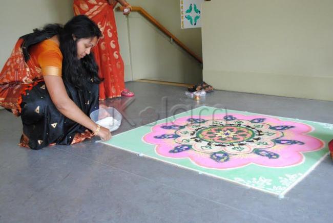
lovely design...a closer view of d rangoli would've been better...
Subtle color combination,as Rani commented a better view of the kolam could have made the design prominent
Very well executed but a better view would have displayed the actual design with all intrecacy designs.
Gud but you might have a taken a pic from top view.
Good ambassoders for our culture.
Gud one.combination of colors is also good. as others said a closer view would have been better
ya i 2 gree with rani and jaanu
Lovely mild colours you have used - would have been happier to see the kolam more closely - anyway thanks for letting us have a view of the creator - good luck :)


