Beautifully done! :)
nice and beautiful.
Wow wonderful work and so neatly done... Preeti very beautifully done
very beautiful
lovely work
nice one amam
thanks for sharing such a beauty
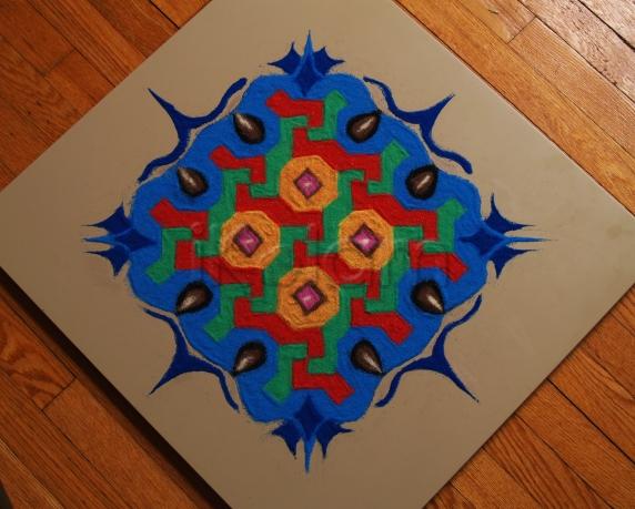
Preeti, wow! it looks like a painting on the tile. The blue outer design is done very well .Very neat drawing with good color choice.
rajamma
very nice chinnu . Border is very nice . the background is light so the colors give a bright effect .
Excellent one...-Indira
OMG Preeti - what a wonderful creation!! Such beautiful colours and well combined too. The green and red looks striking :)
wow!!preeti excellent looks like magic carpet...
Thanks everyone, I'm glad you liked it :)
wow very nice
-Suganthy
The inner rangoli is a very common one! The neat coloring, the outer blue filling and the stylish extensions at the corners make it stand out! So lovely it is!
Nice work. The full four-fold symmetry was not exploited. The blue or green could have been lighter in shade.
Regards! - mOhana
Very very well done. I'm wondering how u get these bright colors with the sand. I'v been trying to mix the sand with food colors and it doesn't look so bright like this. Any tips from ur side?
Thanks again everyone :) Yes Jaya aunty, the inner design is a very common one, and I didn't want to leave it as such :) Rajusree ma'am these are ready made sand colours. These are available in craft stores, but I got mine online - It was a set of 14 colours of which only a few are good.
Thanks for the tips preethi. i will try to get and draw one kolam soon.
preethi very nice with bright colours.


