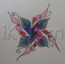
wow preeti mam looks cute to enjoy that peacock's feather it shd've been a bigger picture with regards
beautiful and attractive design.
Preeti though the design is different your usual neatness is missing. Colours also seem to be a little dull here - is it because of poor lighting?? Would love to see a bigger image though :)
Design is different and looks nice. The colour combination would have been better. The pink filling in the centre looks as a different piece.
Preeti, inner design is not very clear. outer free hand drawing is lovely. Just now I put ur geometric kolam with color podi and submitted.Now ur tempting me with another one.rajamma
Thank you for the comments :) Padma ma'am, I agree with you. Now that I look at this, the colours don't seem to be a good idea. But I think I didn't have a lighter shade of violet and had to use the pink there. Yeah Judy aunty, somehow these designs look nicer on paper than on photos :D I was using water-colour paper, and the pencil drawing smudged and so did the colours. That's a huge compliment Rajamma aunty :) I would love to see the design you've uploaded :) I'll upload this without colours soon.
nice design preeti..little bigger and brighter would be great..
very beautiful design.
Nice design.. Somewhere your presence is missing in the kolam..


