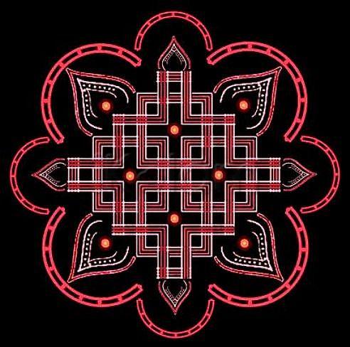
Central design looks very pretty in red and white.
The lamps have gotten smaller, and seem to add just the right amount of light to the kolam. :)
The horse-shoe magnet frills add more beauty to the kolam.
very beautiful creation......i like the center design it looks different.....
The central design is quite a familiar one and with the frills gives added beauty :)
Very nice one... looking forward to many more such designs from the notebook of your better-half.


