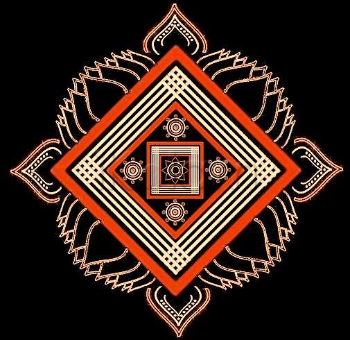
The double stroked lotus outlines are looking very nice in this kolam. I also like how the orange dominates here (makes the outer squares pop out). I see a 3D effect in the 4 off-white lines.
mOhanaji beautiful kolam.orange gives rich look to this kolam
beautiful work JKMji...
Gosh! JKM this is really pretty...
mOhanaji, I am soooooo happy that you have also become a fan of padikolams. From your hand we can expect more and more new designs. This one is looking different with double line lotus and the orange color.
Looks like a hand drawn padikkolam because of the natural looking ezhais!
Amazing Work, JKMji....


