great work....
nice work
viji
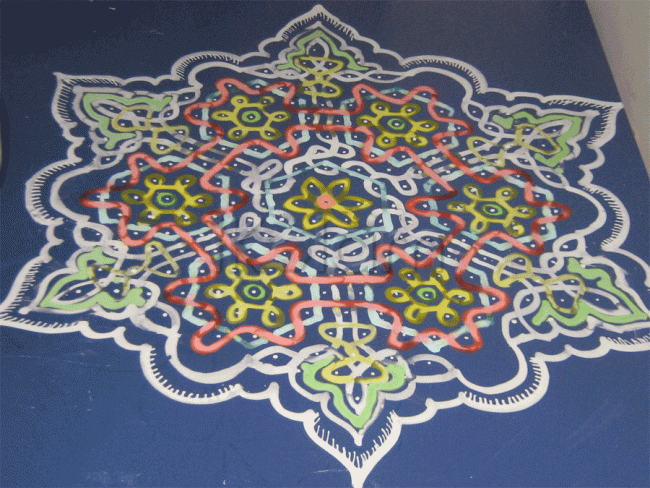
great work and looking very busy. Perhaps a bit more finer lines could bring out the intricacy of this pattern.
nice to see and a good idea.
The central portion is neat and beautiful. The extensions are not symmetrical.
A noval way of using colours with wet rice batter.
great work..nice to see
What can I say? The rangoli says it all!
Very beautiful and quite intricate. While
some rangolis are like short stories, this
is like a novel. I like the minimal use of
colours. I could have thought of running
the lines inside and out to give a 3-d effect.
The use of two yellow colours enhances the
beauty. Best of luck and regards! - mOhana


