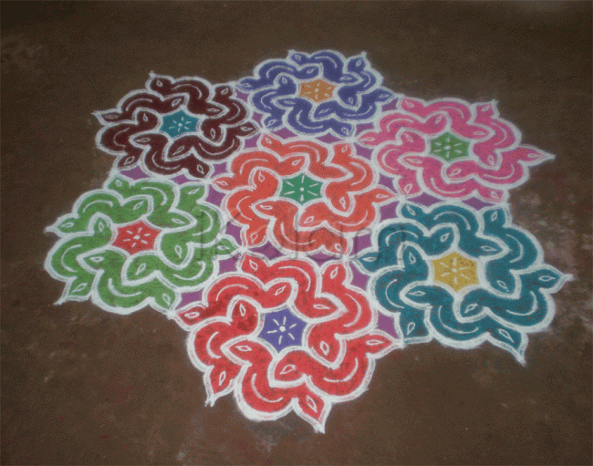
very neat work
beautiful also
Very good design. Neatly done.
You could have brought the brown color to the centre which will make it more attractive!
nice design and neat work. color choice could have been better
nice design ,neat beautiful
cool work
good one
superb
excelent design and neat work
Very nicely executed. But symmetry was destroyed
by the colours. Otherwise, really nice. Best
of luck and regards! - mOhana
Good Kolam but it could have been looked better if u had given the colors in an better way
Nice design, neat and beautiful work
very good symmetry and uniformity u have but the colour choice is not good. always make the centre bright and dark with lighter colours on the outside which will give a 3D effect to any kolam
Beautiful and nice kolam kavitha. I can c ur hard work in your kolam. All the Best for u.
it is veyr nice i like very much.
very beautiful work. Keep it up.
Dear Lata,
What happened to the old kolams. Will it be available in future.


